February 2022 Showcase - Colored Pencil Artwork
The three artists below, featured in the February 2022 issue of COLOR Magazine Showcase, share their beautiful artwork and the inspiration behind it here in our blog.

Hydrangeas at the Morton by Cindy Valek Mottl
15 x 22 inches
Derwent Lightfast, Luminance, Polychromos, and Prismacolor on Arches Aquarelle hot press, 140#
(Artist's own photo)
Nature is one of my favorite sources for art, including forest and water scenes from the area around my lake house in far northern Wisconsin or florals from cultivated gardens.
I began Hydrangeas at the Morton in May of 2020. Covid lockdowns were in place, travel was limited and my sources for reference photos where few. Even the Morton Arboretum in Lisle, Illinois, one of my favorite places for floral photos, was closed to visitors. Luckily I have an extensive collection of reference photos, and I combed through them looking for something to brighten my world and hopefully that of others as well. There I found photos of the hydrangeas which grow in the Children's Garden at the Morton. They were a rusty pink, but in keeping with a "brighten" theme, I adjusted the colors to look more cheerful.
I have almost complete sets of most major pencil brands, and for this piece worked with several to find the best greens, pinks, purples and blues, being mindful of lightfast ratings as much as possible. The detail work is soothing to me – it reminds me of working on a jigsaw puzzle of my own creation. When I finished Hydrangeas a month later, the Morton Arboretum was still closed. It reopened this year, and in August was the location for my son’s wedding reception. The Morton and its gardens are truly a special place for my family and my art.
About Cindy Valek Mottl:

Cindy Valek Mottl has been working in colored pencil since 2000. Trained in oils and acrylics with a B.A. in Art, she transitioned to watercolor and then colored pencil to bring vibrant light and color to florals, landscapes, and portraits. Her work has be juried into International Guild of Realism exhibitions, and the CPSA 28th Annual Exhibition.
See more at: https://www.facebook.com/ColorInLight

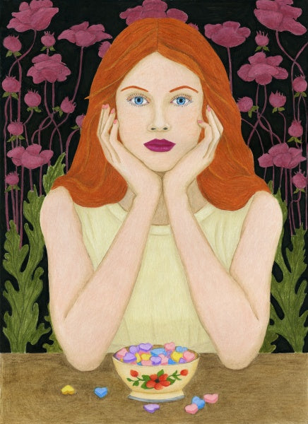
Wishing Things Were Different by Helen Carter
5.8 x 8.25 inches
Derwent Chromaflow pencils on Derwent hot pressed watercolor paper.
(Artist's own photo)
There is meaning behind this piece, and if you feel a sense of melancholy when looking at it, that's a bit of a win for me. The photo was taken at the beginning of the first UK lockdown in 2020, a time when I had a lot of personal things going on. I always seem to have something worrying going on, but during this time I was wishing things were very different indeed. It isn’t a polished social media selfie by any means. My hair needed a wash, I wasn’t sitting up straight or trying to hide my wrinkles and jowls, but it is honest. I hung on to the photo though because it always made me feel a little sad — y'know, like listening to sad music when you’re in the middle of a breakup kinda sad — although now I’m not sad at all.
The colors are meant to represent the mess of emotions I was feeling at the time. There's that bright light from the window which could be considered sunny or hellish, and the play of greens and clashing reds over my face which are both summery and sickly. It’s not pretty, I know! I wanted to make something quite over-the top and yet still truthful.
This piece also was a great way to try the new Derwent Chromaflow pencils. I liked how easily they blended and the vibrancy of the colors.
The portrait now sits on a high shelf in my bedroom. I catch sight of it occasionally and remember how I felt when I took the photo, and how much better I was when I drew it. A good reminder that difficult times are temporary too.
About Helen Carter:

Helen Carter returned to art in 2017 after a 25-year career with no art at all. In 2018 she drew her first colored pencil piece and began taking commissions. She is drawn to unusual and colorful subjects and has developed a highly realistic style that preserves a touch of the artist in the final piece.
See more at: www.helencarterartist.com/

Precarious Balance by Kendra Ferreira
10 x 18 inches
Colored pencil on Strathmore 500 Series Illustration Board
(Artist's own photo)
I have been drawing a series of stacked teacups in a variety of arrangements. My teacups are part of a collection that belonged to my mother-in-law, some teacups were given to me, and others I purchased. My aim is to accentuate the colors, reflections, and the designs that intermingle within the stacked cups.
These past two years have been somewhat unstable because of the changes mostly due to the pandemic as well as politics. As my concept for this drawing unfolded I chose to illustrate that instability by drawing my teacups balancing on a tightrope in a bright blue sky. The blue sky and clouds portray the light-hearted side of imbalance and hope for a brighter future.
About Kendra Ferreira:

Inspired by elements of nature, scenes from travel or a unique view of a still life, Kendra works mainly in colored pencil. She enjoys manipulating color and is always trying to discover innovative new ways of working with colored pencil and new surfaces in which to work on.
See more at: www.kjfdesign.com/
Download the digital version of the magazine for just $3.89, or subscribe and save 15%. Each issue is packed with step by step projects, critiques, colored pencil tips, artist profiles and much more.


