18th Annual COLOR Magazine Member Show
The annual colored pencil show is open to all subscribers of
Ann Kullberg's COLOR magazine.
Click on artist's names in bold to visit their websites.
Prizes for this show were sponsored by
CRAFTSY, The Artist's Magazine, Strathmore, and Prismacolor.
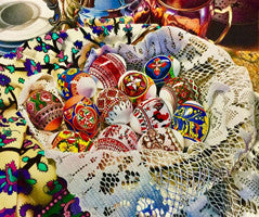
HONORABLE MENTIONBucură-te. Domnul a înviat! |

Oranges |

Canadians Vacationing |
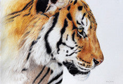
Vanishing |

Annaleigh and Daddy |
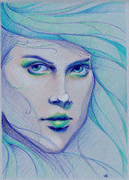
Gaze |

Grey cat in the window |

Maya |

You Can Make a Difference |
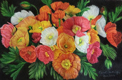
Iceland Poppies |
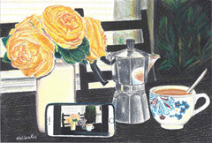
Coffee Click |
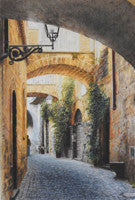
SECOND PLACEWandering Orvieto |
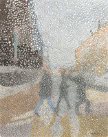
Through Raindrops |
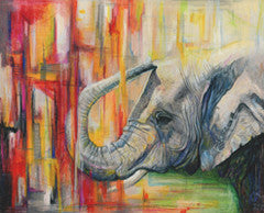
Vanishing |

Storm in Connecticut |
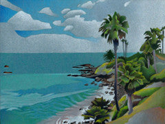
Laguna Beach |
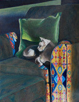
Morning Sun |

Chalk Play |
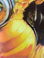
Summer Draught |
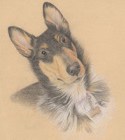
Faith |
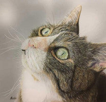
Charlie |

Harmony in Nature |
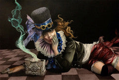
Pandora's Catastrophe |
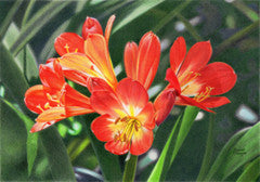
HONORABLE MENTIONHidden |
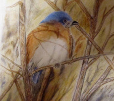
Looking for spring |

Puppy Love |
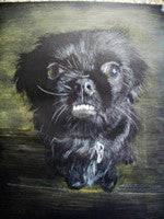
Jovi |
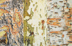
Tree Bark Medley |
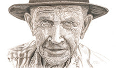
Arnold |
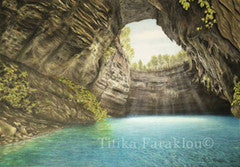
The Cave of the Nymphs |
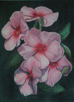
Pink Vinca |
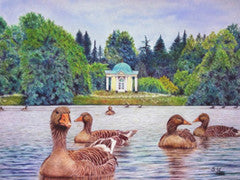
Sweet Memory |
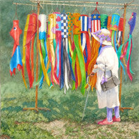
Queen of the Lilac Festival |

Heather and Rocco |

Mischief |
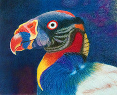
The Molecular Concept of Light! |

Sweet Maggie |
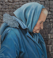
Blue Reverie |
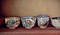
Teacups |
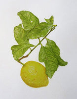
Citrus x limon (Lemon) |

Venice Exposed |
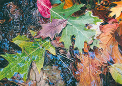
FIRST PLACEUp the Creek |
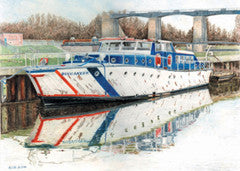
Buccaneer |
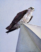
Surveillance |
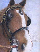
Chocolate Mousse |

And On The 7th Day... |
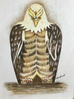
Eagle Sculpture |
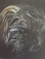
Fenway |
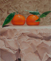
BEST IN SHOWMandarins and paper |
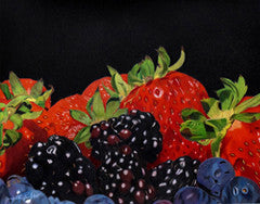
A Heap Of Berries |

The Journey |
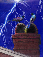
High Level Discourse |
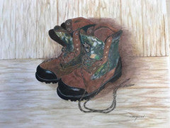
Tommy |
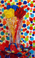
Let's Party! |
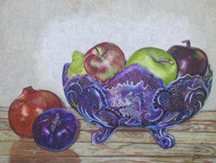
Bol de fruits |

Pinkenba |

Buffalo Mom |
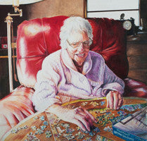
Treasured Times |
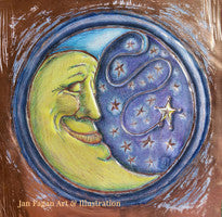
Copper Moon |
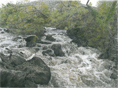
Rushing Waters |
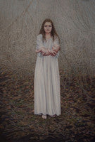
HONORABLE MENTIONLost |
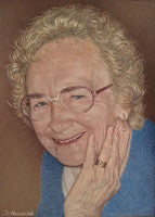
Mum |
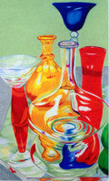
Glass #16 |
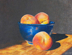
Three's a Crowd |
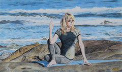
Yoga in Yachats |
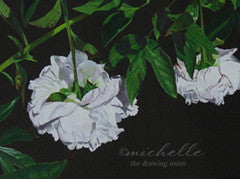
Pining Peonies |
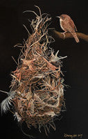
My Feather Bed |
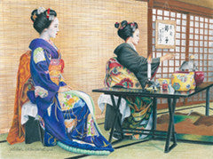
The Apprentice |

The Horeseman |
<< Page 1 | Page 2 >>
Juror's Statement
2017 Juror: Andrew Purdy, CPSA, winner of last year’s Best of Show Award.
Best of Show
Mandarins and Paper by Paco Martin Dominguez

In judging, I browsed all the pieces with a quick glance and then more deliberately several times more. As my eyes scanned all of the entries I was drawn repeatedly to Paco Martin Dominguez’s “Mandarins and Paper” every time.
The simplicity in its message coupled with the realistic representation of the fruit against an even more simplistic crumpled paper background was very hard for my eyes to resist. The perfection of nature’s fruit against the imperfect brown paper was a well-contrived secondary contrasting element. The addition of the rip in the lower portion of the paper helps to guide the viewer’s eyes up to the two gems resting comfortably on the shelf above.
I was both overwhelmed by the simple message of this piece and by the astonishing detail of the tangerines’ skin texture and color. Paco’s portrayal of realistic detail in this eye-pleasing composition has been masterfully done.
First Place
Up the Creek by Karen Hull

Color and movement are exemplified here in Karen’s wonderful nature piece, “Up the Creek.” The end of the summer months, crisp air and a gradual transition to the colder temperatures of winter can be felt in this piece.
What struck me most about this piece was the carefully placed reflection of the clear blue autumn skies above and mirrored in the creek water. Remove this small, but significant feature of Karen’s piece and the peaceful and serene mood is all lost.
Color, composition and thoughtful application of details that are a pleasure to gaze upon have been brought together so very well in a very skillful manner.
Second Place
Wandering Orvieto by Caryn Coville

The daytime view of a quaint Italian village alleyway on a hazy day was clearly conveyed in Caryn’s impressive rendition. The quiet and relaxing stroll through the centuries-old residences was translated so very well.
This piece beckons your eye closer in an attempt to put yourself onto the walkway in a hurry to catch up with the pedestrian who is making his way around the distant corner.
Caryn accurately portrayed the length of the path with slight changes in color and dissolving details to give the viewer the sense of distance and depth, which both leads and pulls the eye to and from the end of the path and out again.
The light coming off of the cobblestones and reflected off of the bottom surfaces of the arches in the foreground and to a lesser degree in the second and third arches truly placed this work above so many others. The play of light was what made this colored pencil painting such a success.
Third Place
Old Masters Tribute by Irina Garmastova-Cawton

When I view this work I am asked, how long of a journey back in time will it take me? Will it be a memorable one? Irina has applied great talent to successfully take us all the way back hundreds of years to the days of the unique ambiance found in the works of the Old Masters.
She has constructed an image that not only by the title but also more importantly by her skillful achievement, gives homage to a time and influence of centuries ago.
The tonal quality of this image united with the two soft sources of light that illuminate the objects does in fact cause you to reflect on the same style seen in the works of the 16th- and 17th-century Dutch Masters. The addition of the detailed reflections in the glass was perfectly executed and adds invaluable authenticity to the entire piece.
Irene managed to summon Vermeer, Rembrandt and Frans Hals very successfully in this beautiful commemorative to those great artists while still imposing her own style.


