
August 2025 Showcase - Colored Pencil Artwork
The three artists featured in the August 2025 issue of COLOR Magazine Showcase share the stories behind their beautiful artwork here in our blog.

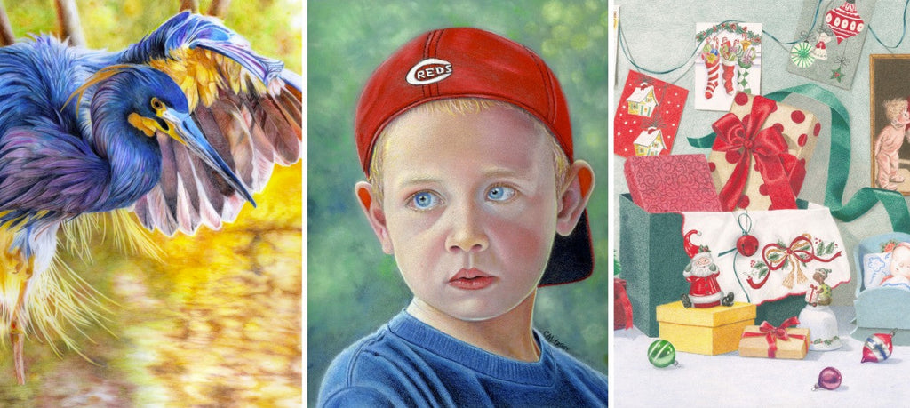
Snuggletime by Kirsten Walsh
14 x 17 inches
Caran d'Ache Luminance and Prismacolor colored pencils on Saunders Waterford HP 300 gsm. (Client’s photo reference. Used with permission.)
This was a private commission of my client’s grandchild, and one of three in the series. Each portrait was so special, created as each child came into the family. The reference photos were of stunning quality and made the job so much easier. Good references are a must. I love the texture of the bunny I was able to create and the soft knitted finish of the hat.
I used a mix of Luminance and Prismacolor for their creamy finish and soft color range. I love the buttery feel of the pencils; they are perfect for blending and layering for the opaque finish achieved in the end.
The paper was Saunders Waterford HP 300gsm. It is not often used for pencils, but it is such a gorgeous paper to work on. I prefer its smooth surface, and opt for hot press every time. Other favorite surfaces are Arches and Rising board.
About Kirsten Walsh:

Kirsten is a full-time artist living on the Surfcoast of Victoria, Australia. She started creating artworks using pencils in 2016, after a long gap from doing any art. She quickly found her love for pencils again and has been fortunate to have many commissions, which has grown her practice to a full-time career. She now also does large-scale charcoal drawings.
See more at www.instagram.com/kirstenwalshfineart

Loki by Philip McDonald
12 x 18 inches
Polychromos colored pencils on Strathmore Bristol Smooth. (Photo by Kate Barker. Used with permission.)
Drawing white fur on white paper: We all know what a nightmare that can be, don’t we? But using that negative space and losing edges, allowing the subject to blend into the background, can be so creative. And there’s so much color there when you look, too. This was something that took time for me to understand. You can learn all the techniques and tips and tricks in the world, but learning to look properly, to see, you have to do that yourself. That’s ongoing, of course, and I’m still learning. I loved working on this commissioned memorial piece. He is such a beautiful animal, and I wanted to do him justice. My customer was happy with the result, and I was, too.
About Philip McDonald:

Phil was born in Yorkshire, England and raised in the British Army in Germany. Phil’s work centers on British birds and wildlife. He hopes to make a living from it one day. Now in his 50s, he is married and living in Yorkshire. He has two beautiful grown-up daughters and two wonderful granddaughters..
See more at www.philipmcdonaldfineart.co.uk

Links to the Past by Sonja Johnson
6.75 x 9 inches
Prismacolor, Polychromos and Holbein colored pencils on Canson Mt-Teintes, black. (Artist’s own photo reference.)
I took the reference photo for this piece long ago on a wonderful visit to Williamsburg, Virginia. I could hear music coming from the front door of a beautiful old church, and I noticed the church’s cellar, which had a very old lock and chain securing its door. I was attracted to the sunlit rusty colors and patina of the vintage handmade lock and chain bathed by the early evening light. It was banged up a bit from the passage of time, as was the peeling paint on the cellar door that it rested upon. But it was the dramatic contrasting values made by the golden light and the intricate shadows cast by the chain on the peeling paint that most attracted me to this scene, inspiring me to draw it.
My favorite black paper, with its slight texture, was a perfect surface to help me convey the vintage feel, moodiness, and dramatic light effects of this subject. In some areas, I left the black paper uncovered, or barely layered, for the darkly shadowed areas of the background. I also let the black paper subtly show through the layers in the shadows of the rusty metal chain and patina of the lock. The rusty colors of the metal were a pleasure to render, but the big challenge for me was rendering the many areas of peeling paint and the places where the worn wood peeked through the peeling paint on the door.
I like to apply many vertical, light layers in my pieces, always with a sharply pointed pencil. This, along with the texture of the Mi-Tientes paper, gives my pieces their textured look.
About Sonja Johnson:

Sonja’s love of drawing was encouraged by her artist mother. In the 1980s, studying commercial and fine art in college, Sonja discovered colored pencils, but became an architectural draftsman because it was a practical job. Colored pencils are still the perfect medium for her meticulous nature. Sonja is inspired by the vistas and old barns of Idaho.
See more at www.instagram.com/sonjamjohnson

Download the digital version of the magazine for just $4.99, or subscribe and save! Each issue is packed with step by step projects, critiques, colored pencil tips, artist profiles and much more.