Portraiture with Dark-Skinned Models
by Robin Rudolph
As a child, I had been taught to see colours in faces, particularly black skin which is vibrant with colour. This also allows me to see colours in all areas of life. With various teachers, I vastly improved my coloured pencil portraiture, learning to add more colours to a face. And I can put into practice my lifelong observations with the new techniques I have learned.
Journey from 2017 to 2024
I was born into an artistic family and have always been involved in art. In College, I received a BA hons degree in fine art. I have worked in many different mediums. In September 2017 I discovered Craftsy.com and took a coloured pencil portrait class where I used cheap paper and Crayola pencils. I cringe sharing this but I believe it is useful in seeing how my journey progressed from there.
I adore portraiture, and in particular, drawing people with dark skin as there are so many fabulous colours to work with – reds, blues, greens, and purples. In some the tones are colder and in others warmer. Fair-skinned people have lots of colours but they are generally less dramatic and subdued. I am always pushing myself, taking Zoom classes and working with tutorials to improve my knowledge, and every new challenge starts with the thought—“what on earth was I thinking!?” Eventually, I find a way to overcome difficult problems and am pleased that even with mistakes, trials and tribulations, I learn something new and valuable.
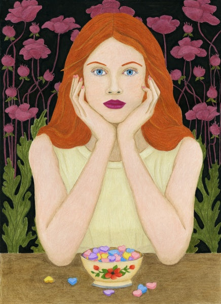
Having studied with various coloured pencil artists, I found my way to Jesse Lane and there my work in portraiture improved enormously, and in 2023 I was astonished and thrilled to come 4th place in CPSA Explore This 2023! Online exhibition, winning the Outstanding Achievement for the portrait of my dear friend Len.
My Len
With Jesse Lane, I learned to start with values (Grisaille technique with grey values) but with browns and creams. The same colours can be used for dark or light skin but the application will differ, with the darker colours being used more for dark skin and vice versa for light skin. Then I start adding colour, also more reddish browns. Some of my models have more orange in the skin tone, and others are more purple or red. Another thing I learned from Jesse was to use greens to balance out reds.
I had to discover which paper worked best for dark skin portraits and at the moment, the Strathmore Vellum 300 series is quite good as it can take lots of layers. I found Strathmore Vellum 400 too toothy and I had to use OMS to blend the pigment or I would have been layering on into eternity! Strathmore Bristol Smooth 300 does not take enough layers but is great for smoothing out the colours easily.
Even with Vellum 300 a blending tool can be needed, such as a colourless blender (I like Caran D’Ache the best), a stiff scrubbing brush (Royal & Langnickel Zen brushes) to push the pigment into the paper, or OMS (Zest It, Gamsol, etc.). Also, using too much OMS can make the paper sticky and lift pigment. Less is best. I also like burnishing either with white or a lighter coloured pencil in the value and hue I am working with, i.e., if using darker pink tones I might burnish with a lighter pink.
One problem I just discovered was that using the brushing technique and then temporary fixative and OMS lifted the pigment and the paper was overworked. So, I now know I need to stick with one technique for pushing the pigment into the paper.
My signature style is to have black backgrounds as I adore how that makes the face pop and be the centre of attention. With dark-skinned models, it is much easier to get the edges of the portrait blurry so that it can blend into the background seamlessly.
“Even with mistakes…
I learn something new and valuable.”
I am always looking for interesting, candid, or unusual photos of the person talking, looking away, or down. I prefer to capture the eyes open, however, in some photos, if they are closed, especially if they are looking down, it adds to the story.
I have to use my photos as an art reference for the notable coloured pencil societies. I use a camera phone and even if the photo is awful, I can turn it into something that looks quite good by cropping, taking out unnecessary colours, putting in my black background and suddenly an ordinary photo becomes an amazing portrait.
Listening
I generally start from dark to light and add mid-tones. A good way to assess tonal value is to print the reference photo in black and white as it can be easier to see where the darks and lights are.
I use Prismacolor Premier for portraits as they are soft and blend well. Also, Holbein is lovely and soft. Faber-Castell Polychromos are harder and the point lasts a longer time and they are good for fine detail. Prisma Verithin also have a thinner hard sharp point for detail. Caran D’Ache Pablos are hard and have a good point as well as lots of colours and I like using them on Clairfontaine Pastelmat when I want to do a portrait on a coloured background rather than white paper.
In the past, my drawing was not particularly realistic but now with coloured pencils, I am fascinated with realism in portraiture.
I hope my article has been useful.
Enjoy!
ROBIN RUDOLPH:
Born in the USA, 15 May 1953, Robin Rudolph has an honours degree in fine art and moved to England at 24. With a range of artistic talents, Robin focuses on coloured pencils, pouring her passion into creating realistic depictions of portraits, animals, birds, horses, flora and fauna.Her talent has been recognised internationally, earning prestigious awards and solo exhibitions online. Robin has published articles in prominent art magazines, and her art hangs in the USA, France, and England.
Instagram: https://www.instagram.com/robin.rudolph.fineart/
Comments (2)
I have not been able to locate an adequate amount of Ann Kulberg’s illustrations on various colors of African American skin colors. I have not located any blends of various shades of Black skin. Do they exist?
Robert williams - Jun 15, 2024Robert Williams – so sorry I never received your question. I suggest studing with Jesse Lane who loves drawing dark skinned people and has a whole system of colours to use.
Robin Rudolph - Jun 15, 2024Hope this helps