Judge not, lest ye be judged...Unless they ask nicely!
 I spent Saturday morning judging the Drawing category of the Fine Art Exhibition of the Washington State Fair. It is the second time I've been asked to judge at the Fair, and I have felt equally honored both times! I learned that our state fair is the 7th largest in the nation! 1.2 million attend, and about a quarter of a million see the Art Exhibition - more if it rains a lot in a particular year. Wow. That's a pretty big deal.
I also learned that...OMG...you better be careful about how you frame the work you enter into a show!
I'll start at the beginning. We judges all arrived in the cavernous Exhibition Hall at 8:30am, bringing our resumes and a piece of our own artwork. Lots of fruit and pastries were offered but no coffee. A bit of growling ensued...artists aren't really known to be morning people, and it kinda showed. Coffee was eventually graciously served, we all became human again, we were given a run-down of the rules and procedures, and then off we went to our own categories.
When you judge the Washington State Fair Art Exhibition, you have a co-judge. The two of you decide which pieces stay, which get rejected, which get awards, and which are swept away temporarily to be shown during the fair's Second Show. I asked to see my fellow judge's own work...and it was gorgeous. Very sensitive, technically beautiful graphite portraits. I was very impressed.
From there, I suggested we run through the Drawing show once, quickly, weeding out the number of pieces we were required to reject. (Each category had a different number that needed to be culled, depending on how many were entered in that category.) That was easy, and we agreed on the 4 that we needed to reject. Next, we went through the show again, taking longer with each piece...but just long enough to say "possible award winner" or "no award" about each piece.
Here is where I got a real shock. My co-judge was an absolute stickler about presentation. I mean...nearly obsessed! He had a comment about the frame or mat for nearly every piece. I think he actually looked at the framing before he looked at the image itself. We stood in front of one really exquisite graphite drawing, and he said something like "Yeah...it's nice...but the shadowboxing wasn't necessary and I don't like the color of the mat at all. I don't think I can give it an award with that presentation."
Floored. My jaw dropped. Huh??? But...but....it's a gorgeous piece. It's perfection. And I LIKED the mat...although I agreed with him that the shadowbox effect detracted. I stood up for the piece. I pointed out how every single thing in the piece itself was perfectly executed. I coaxed him a few feet back so he could see it from a distance. And, because I'm a stubborn thing....it got an award. :-)
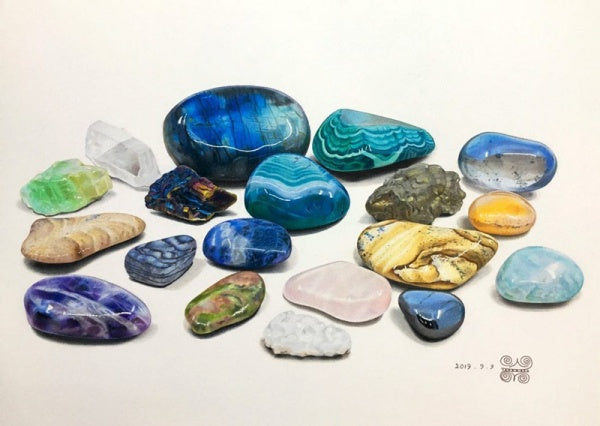
The rest of the judging went really well. And in fact, I'm very pleased to say that 1st Place in the Drawing Category (which included graphite, charcoal, pastel and colored pencil) went to a colored pencil piece! He wasn't crazy about the off-white mat that the winning piece had, but when I explained to him that colored pencil artists often mat in white because that is what the CPSA Annual Exhibition requires, he mellowed, and agreed that it was a really stunning piece. Blue Ribbon awarded!
But boy...did I learn a lesson that I couldn't wait to pass on here on the blog. Don't over-do the framing and mat. If you can't cut a really, really straight mat, then leave it to the professionals. Keep it simple and try like heck to enhance the image without calling too much attention to the mat and frame. Don't overwhelm your art with a lot of fancy framing. Your framer will try to talk you into that...but remember that that's their business and of course they want to sell you elaborate framing. It's great for their bottom line, but might not be so great for yours!


 I spent Saturday morning judging the Drawing category of the Fine Art Exhibition of the Washington State Fair. I learned that our state fair is the 7th largest in the nation! 1.2 million attend, and about a quarter of a million see the Art Exhibition. Wow. That's a pretty big deal.
Comments (31)
Great advice Ann – thank you for sharing :)
Karen Hull - Aug 10, 2013