Ann Kullberg's Colored Pencil Magazine's 14th Annual Member Show - 2013
Welcome to 14th Annual Member Show - 2013
Held every May, this annual show is open to all subscribers of Ann Kullberg's Colored Pencil Magazine.
If you'd like to enter this year's show and are already a subscriber click here >>
If you'd like to enter this year's show and are NOT a subscriber, you may subscribe here >>
 Tangerines 11 x 8.5 Dorothy DePaulo |
 Cream, saffron and peaches 11.5 x 8 Sunil Joshi |
|
 |
 The Jokers Wild 8 x 11 Angela Bartlett |
 Foot Traffic 13.5 x 11 Bill Shoemaker |
 |
3rd PLACE |
|
|
|
 I'm Not Your Sweetie 10 x 16 Becky Neideffer |
 Untitled 11 x 8.5 Elizabeth Guthrie |
 Jolie 12 x 16 Brigitte Courté |
 Taylor 2 8 x 10 Chris Butcher |
|
 Cape Cod Hydrangea 24 x 29 Mary Hobbs |
 Stages of Cotton 8.5 x 9 Linda Barnhill |
 1st PLACECloser to the Light11 x 14 Cheryl Metzger |
 Full Moon 8 x 8 Linda McKay |
 Fancy Face 11 x 18 Glynis Carey |
|
 HONORABLE MENTION Herb 11 x 17 Tracy Frein |
|

|
 Imagining 12 x 18 Pamela Skubal |
||
 Rocks & Dunes 10 x 5 Linda Remington |
 Summers Glory 7.45 x 9.75 Linda Phillabaum |
|
 Mother and Son 15 x 18 Philippe Thomas |
|
|
 Joy 12 x 12 Grace Cowling |
 Parrot Tulip 5 x 7 Raquel Baranyai |
 Missouri State Fair Foliage 8 x 10 Rebecca Limback |
 On the Rocks 14.5 x 10 Jo Goudie |
 Morning Ritual 8 x 10 Ann Oliphant |
 It Really IS Greener 9.5 x 16 Faith Wheeler |
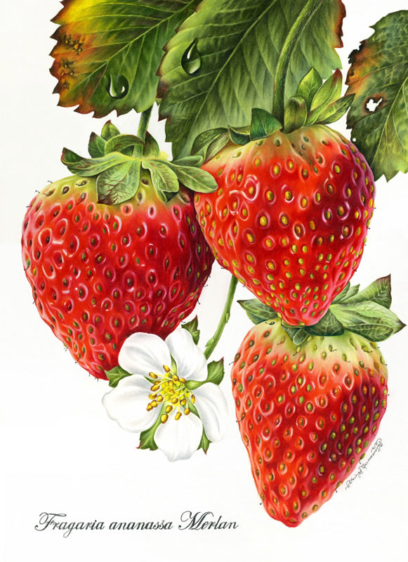 Strawberries 11.5 x 16 Irina Garmashova-Cawton |
 |
|
 Free Birds 13 x 9.5 Kathryn Ramsey |
 HONORABLE MENTION Thinking of England 13 x 20 Liz Guzynski |
 |
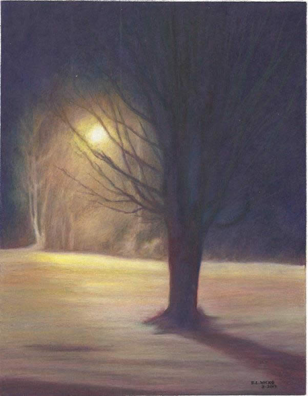 Night Light 8 x 10 Sharon L Hicks |
 Slick 8 x 10 Gail Seufferlein |
 |
 HONORABLE MENTION I Love Chocolate! 16 x 25 Heidi Günther |
 Chocolate Dream 7 x 10 Dorée Voychick |
|
 BC Cougar 11 x 14 Jon Horvath |
 Shy Sadie 8 x 10 Cathie Martin |

Sammie and Missy
11 x 14 Diane "Deedy" Gregg
|
 Soaking up the Colors 12 x 8 Angela Matuschka |
 Water Lilly 14 x 16 Lorraine Evans |
 Country White 12.25 x 18.25 Elizabeth Dobes |
 HONORABLE MENTION Sentry 11 x 14 Kim Hammel |
 Rosemary in Winter 11 x 14 Janice Norton |
 Nap Time 8 x 10 Kathe Suddendorf |
 1st PLACE
Reflections9 x 12 Howard Harris |
 Venetian Marble Game 8.5 x 12.5 Bruce Hudkins |
 Alyssa II 9 x 14 Carole Maltby |
 Mask Two 11 x 14 Pamela Belcher |
 3rd PLACEMotmot in Quintana Roo6 x12 Sharon Hester |
 Laughing in the rain 12 x 9 Jolene Stinson Williams |
 Shelby 9 x 12 Aleksandra Davis |
 Daisy Cupcake 8 x 8 Cynthia Knox |
 Old Man Sam 10 x 8 Cynthia Embree-Lavoies |
 Spring Bursting 12 x 10 Jan Falter |
 Chippy 11 x 8.5 Diane Siracusa |
 Grace 16 x 20 Carole Pederson |
 Hisbiscus 9 x 11 Susan Richardson |
 Snowy Egret 18 x 22 DJ Murray |
 |
 Summer in a Basket 10 x 13 Susan Moyer |
 Ian 9 x 12 Kathy Dolan |
|
|
|
 The Glorious Changes and Transformations in Life 18.5 x 12 Donna Schwarz |
 The Equestrian 11 x 14 Ginette Cormier |
|
|
 Matt and Chris - Summer '92 20 x 30 Dan Stancliff |
 |


Entry Info for the 15th Annual Member Show here >Our Juror - Julie Podstolski
I left New Zealand as soon as I finished university to settle in Australia where I’ve lived ever since. The idea was to come here for a year, save up and go overseas. But one thing led to another…marriage…children – and here we are.
My website is www.juliepodstolski.com Since January this year I have been tending (just like one tends one’s garden) a blog, the subject of which is, unsurprisingly, art. http://juliepodstolski.wordpress.com Juror's StatementWhen one is asked to judge an art award, how does one begin? I started the process, before I had even looked at the works, by jotting down a few words in my notebook. The words were, in this order:
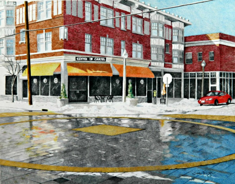
What was I getting at with this list?Technique is valuable but in a vertical hierarchy, it comes below emotion, visual poetry or an unusual point of view. What I mean is, perfectly perfect may, in a hypothetical example, have less impact than rough-around-the-edges depending upon the feelings and/or ideas exhibited in either case.Well, you know how subjective art is. It isn’t like marking mathematics papers. No matter which way you judge it, it will be a case of comparing apples with pears…no straightforward rights or wrongs here. So while you, the artist, have your point of view, I also had to find mine for this task. When I looked at your work, a silent dialogue took place between you and me. I observed and asked you questions. You replied. Sometimes your title was part of the reply. It is amazing how a title can help the viewer to understand the artist’s intention. You used your compositional devices to help me tour the work. You took me on your personal journey, showing me each subject that was important enough that you would devote hours and hours of time to it. To those of you who didn’t get a mention, just remember that this is not an absolute science. I represent one person’s opinion only. If there were twenty different jurors, I expect that there would be twenty different opinions. Finally, what a gift it is to be an artist! Surely every one of the entries in this body of work is a labour of love. Each and every work is worthy of celebration. Best of Show: “Reflections” Howard Harris“Reflections” is a moody and evocative landscape, superbly crafted. There is something of the spirit of Monet about this work. Howard shows his audience a tranquil yet bleak landscape; a place which might reflect the intensity of one’s own feelings, be they blissful or melancholy. This deeply contemplative work is simultaneously intellectually and emotionally satisfying. 1st Place: “Closer to the Light” Cheryl MitzgerIt is hard to look away from the intense gaze of this lady’s eyes as she scrutinizes the viewer even as the viewer studies her. While her body bends under the weight of age and time, her eyes reveal a soul unafraid and strong. Her wrist watch ticks away time but the blue and lilac colours of clothes and wall symbolize serenity. This is a drawing as powerful as it is dignified. 2nd Place: “Motmot in Quintana Roo” Sharon HesterSharon’s pencils have convinced me of the reality of this jungle. I can feel the tropical heat and smell the pungent scents of leaves, bark and damp soil. The motmot reigns over his world; all is bathed in luminosity. If a work can have a voice, then this work sings. 3rd Place: “Maryland Plaza” Susie TenzerIn the American photorealist tradition, this urban-scape ‘tells it how it is’ without embellishment. I particularly like the reflections in the paving stones plus the use of power lines and road markings as compositional tools. Her observations remind her audience that there is artistic value in everyday surroundings which most of us take utterly for granted. 4th Place: “Graffiti” Holly SinsicalHere is the jittery energy of youth, impatient to get on with growing up. Quite the opposite of “Closer to the Light” the subject of “Graffiti” has a nervousness and vulnerability about her. She looks intently but is not making eye contact. Rather, she seems to be focussed inward; questioning. Honorable Mentions“Herb” Tracy Frein As Herb is splattered with pigment, I make the presumption that I am seeing his fresh creation reflected in his glasses. An unusual and striking piece. “Sentry” Kim Hammel This drawing is an advocate for ‘less is more’. To the point, no extraneous information needed and in doing so, the spirit of the incorrigible gull is captured. “Thinking of England” Liz Guzynski A humorous subject and treated rather royally. The formal seat is throne-like making for an aristocratic atmosphere. Courtly life perhaps. “I Love Chocolate” Heidi Günther What a meticulous study. It must be deliberate that Heidi puts the word ‘teasers’ right in the middle. She knows she is teasing her audience with the mouth-watering nature of her subject. “Bowled Over” Iris Stripling An intense study where every surface is rendered to exquisite perfection. It is impossible not to be bowled over by the luscious objects of Iris’ still life. “Lady in Red” Sherri VanSchaick The humble beetroot has been elevated to star in a vibrant and eye-catching work of art…a reminder that no object is too humble to catch the artist’s attention. |
 I’ve been drawing and painting my whole life. After taking the art stream at high school, I went straight to university to study fine arts (University of Canterbury, New Zealand), emerging three years later with a Diploma of Fine Arts, majoring in painting, in 1980.